It can be very tempting to stick plants of all colours in any gap in our gardens, particularly if an avid plant-a-holic. However, this can result in a collision of competing colours. Competition – as we’ll see – can be excellent, but without some consideration, no one wins. Plants are simply lost among each other. Using colour wheel planting will help avoid this problem.
You might recall studying the colour wheel in school art lessons. It seems like just another element to learn at that point. As in many cases, the funny thing is that the colour wheel can be immensely useful in a whole range of adult situations: preparing for a kids’ party, redecorating rooms in the house, or planting up gardens.
The colour wheel
There are some basics to remember. Yellow, red and blue are the primary colours. Begin with these three if all else fails you. We find orange, violet and green between these three. They derive from blending of the primaries and we call them secondary colours. Finally, between each of these primary and secondary colours is another, a combination of the two either side. For example, between blue and green we encounter “blue-green”.
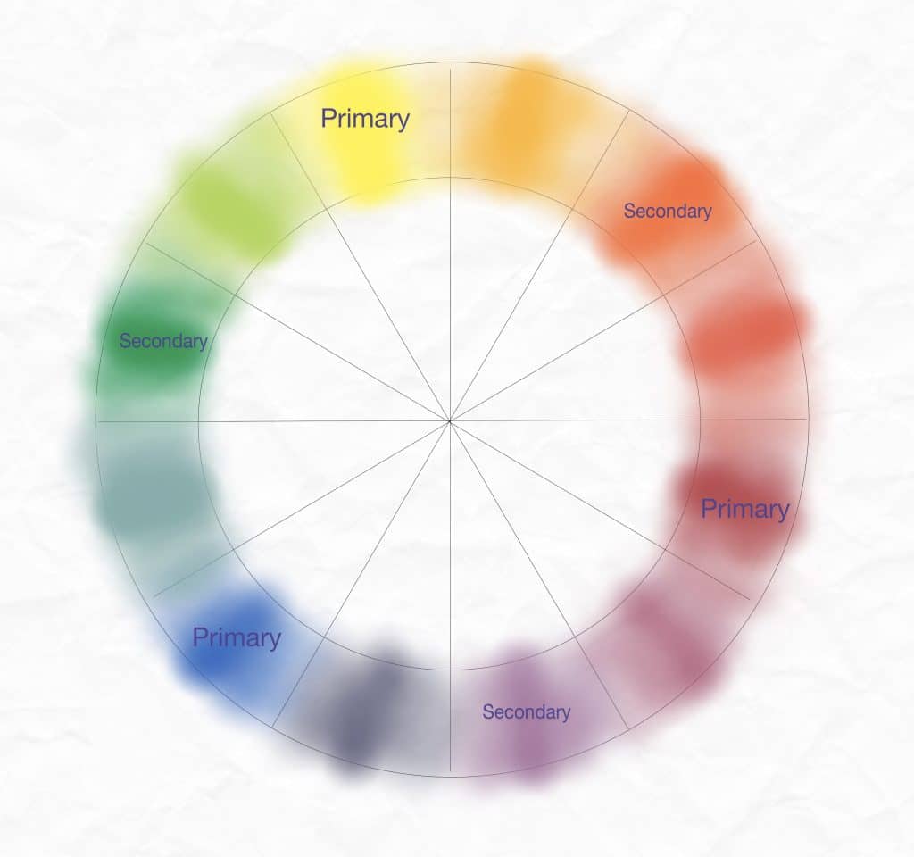
More detailed colour wheels show a shift from a tint on the outer edge towards a shade in the centre. Tints are each colour when white is mixed in, thus lightening them. Conversely, shades are colours where a degree of black has been added. Flowers exist in various tints and shades, but the main facet when planning is to focus on the main colours. If they’re harmonious, their tints and shades will harmonise too.
Application 1: Harmonious colours
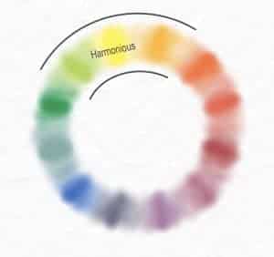
We’ve just mentioned harmonious colours. These exist side-by-side on the colour wheel; the example illustrated is yellow-green, yellow and orange-yellow. The effect of harmonious colour is to sooth and gently lead the eye through a scheme. Use colours from the yellow-orange-red side of the wheel for heat; the green-blue-violet spectrum cool things down.
When planting harmoniously, assess which flower colours bloom at roughly the same time of year. Using this colour scheme, we could opt for a combination of mid- to late summer flowerers:
- Achillea ‘Moonshine’ – yellow
- Alchemilla mollis – yellow-green
- Crocosmia x crocosmiiflora ‘George Davison’ – orange-yellow
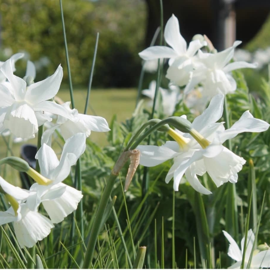
The following image shows harmonious planting between two species such as Aster, Astrantia, Lobelia and Phlox. Note how the violets and blues sit on the cool side of the spectrum.
Application 2: Complementary colours
Colours found opposite or away from each another on the colour wheel are described as complementary or contrasting. Their opposition excites and enlivens the design.

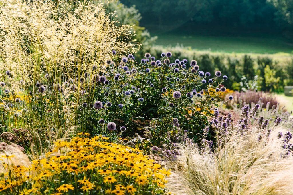
We’ve picked out the complement between yellow and violet on the wheel above. Using this, we could plant September-flowering Rudbeckia fulgida var. sullivantii ‘Goldsturm’ with Aster x frikartii ‘Mönch’. Rudbeckia complements another plant below at one of our own designs; the blue here comes from Echinops ritro ‘Veitch’s Blue’.
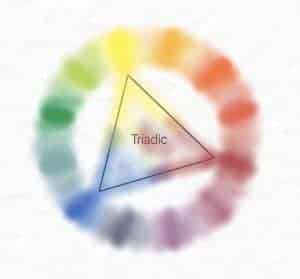
Application 3: Triadic colours
Similar to complementary colours, a triadic scheme involves three colours from contrasting sides of the wheel. We’ve highlighted this approach with yellow, red and blue – the primary colours. Following a triadic application brings an intricate sense of motion and vibrancy.
A good late summer scheme utilising these colours would include:
- Rudbeckia laciniata – yellow
- Helenium ‘Ruby Tuesday’ – red
- Nigella damascena – blue
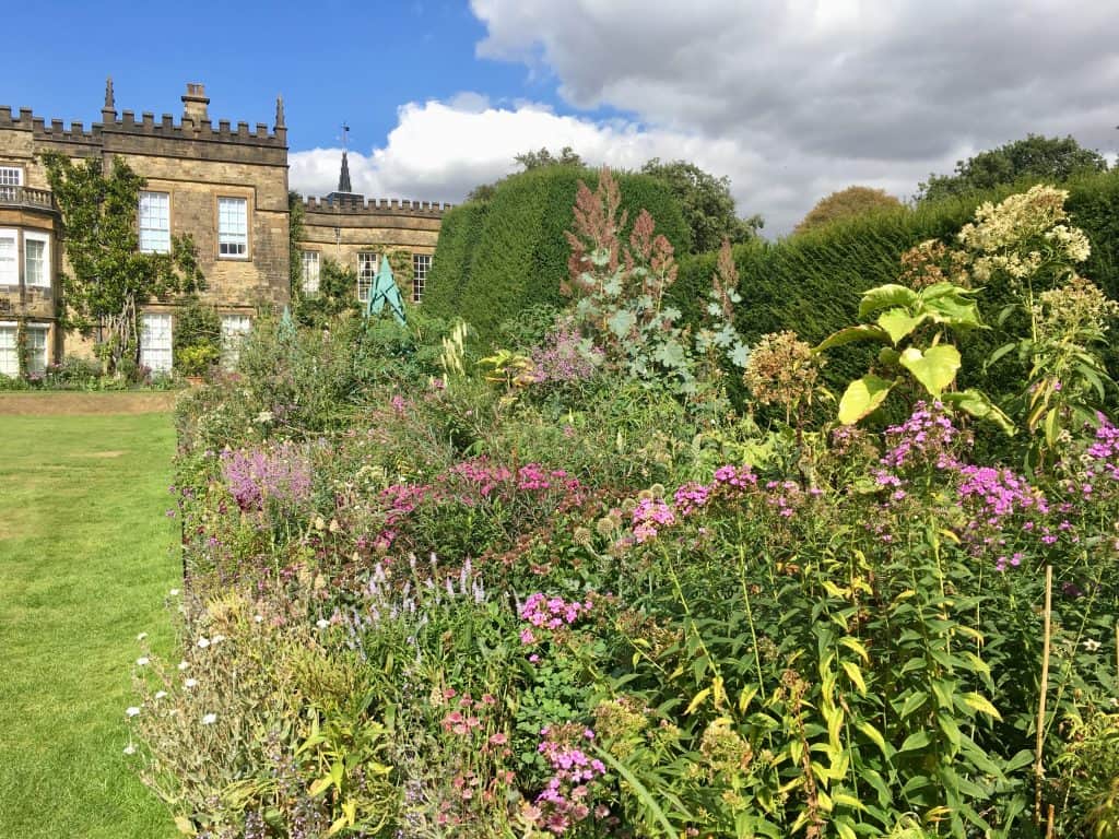
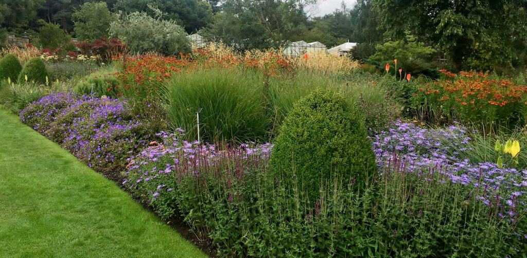
Similarly, the planting layout below unites cool blues and violets (Aster, Geranium) with hotter reds and oranges (Helenium) as well as vivid bursts of yellow Kniphofia.
Next time you’re replanting a border, overhauling your garden or even just planting up pots, grab a copy of the colour wheel and consider the look you want. Are you going for peace and harmony, or a riot of colour?